SAST Overview
The SP360 Static Application Security Testing (SAST, also referred to as Static Code Analysis) Dashboard offers significant functionality for the continuous monitoring capabilities for Vulnerability Management. It enables you to get deep insights into different Key Performance Indicators (KPIs) for your source code contained in the connected code repositories by offering many filters to configure your view into your vulnerability data.
Whereas all the other dashboards get their vulnerability information from Qualys, the Static Code Analysis information provided in this dashboard leverages SonarQube, which returns not only vulnerability data, but also information about Bugs discovered in your code. This dashboard enables you to focus on the vulnerabilities and Bugs that are most important for your organization. In addition to illustrating the “current state” of vulnerabilities, it also adds significant insight into the historical “trending” so you can see the progress your organization is making in addressing any and all outstanding vulnerabilities.
New Update: By default, SP360 now does not display Bugs in the SAST dashboard to ensure vulnerabilities remain the primary focus. Previously, both vulnerabilities and bugs were displayed for each repository, but the higher volume of bugs often obscured critical security issues. Users can adjust the filters to include bugs if desired. To remove the Bugs column in the SAST asset list, use the “Reset to Default” option in the column configuration panel.
Filtering Chart Content
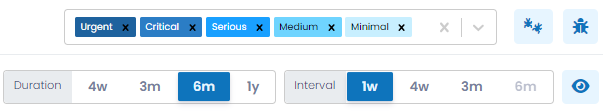
For ease of use, options/buttons at the top of the dashboard can be used to filter the chart information. In addition, the last section of the dashboard (i.e., SAST list) allows you to include or exclude the Code Repositories that contribute to the Vulnerability (and Bug) data.
| Options/Buttons | Descriptions |
|---|---|
| Severity | From this drop-down you can select one or more severities of interest to alter the charts accordingly. The severity of each Vulnerability (or Bug) is classified as Urgent, Critical, Serious, Medium and Minimal. Hovering the cursor over the chart shows the breakdown of Vulnerabilities (and Bugs). |
| By clicking this button, you can filter (limit) the available information to only the Bugs found while performing the static code analysis. All the charts will be modified to show entries specific to Bugs. Clicking the button again will restore the default view, showing only Vulnerabilities and hiding Bugs from the UI. | |
| By clicking this button, you can include both Bugs and Vulnerabilities in the dashboard view. All charts will update to reflect the combined data. Clicking the button again will restore the default view, showing only Vulnerabilities and hiding Bugs from the UI. | |
| Duration | Using this control, you can establish the time-period the chart covers. The available options are 4 weeks, 3 months, 6 months or 1 year. |
| Interval | Using this control, you can establish the period of time each data point represents. The available intervals are 1 week, 4 weeks, 3 months, 6 months or 1 year. The intent is to enable you to view the trending over the desired time periods; for example, month-over-month, or quarter-over-quarter. |
| To view the Vulnerability (and Bug) counts for each interval in all the charts you can use this toggle button, which removes the need to hover over the chart. | |
The SAST dashboard provides information for Vulnerabilities (and Bugs) in three sections:
- Vulnerabilities Trending History
- Current Vulnerabilities (i.e., current counts)
- Vulnerability Metrics
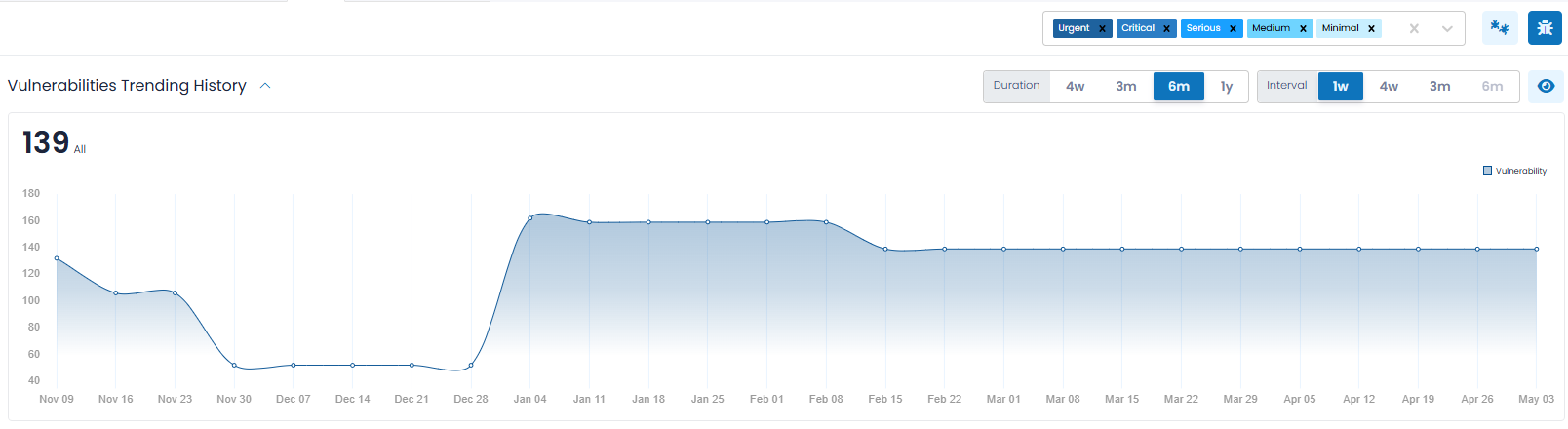
Vulnerabilities Trending History
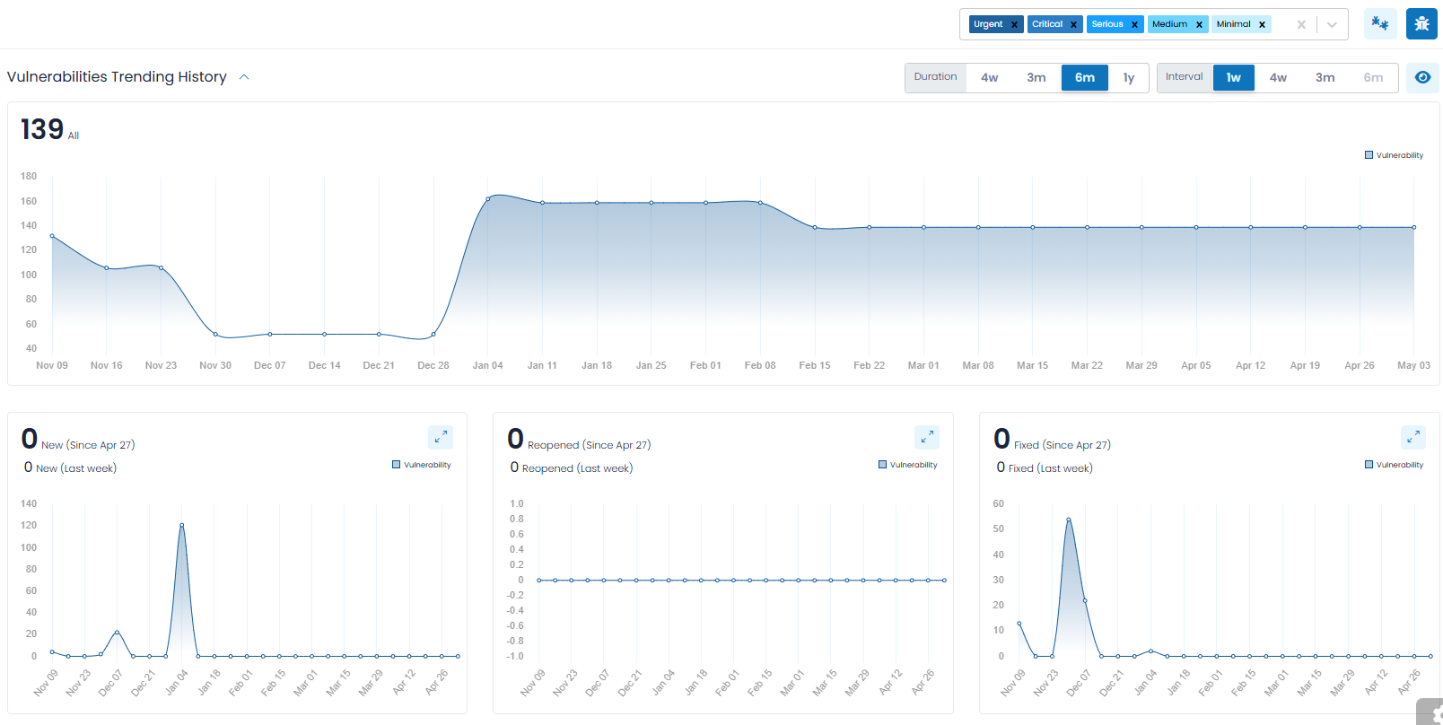
Vulnerabilities Trending History (which is a collapsible section) provides you with an overall trending of Vulnerability (and Bug) counts, so that you can observe the progress made over time. The data is represented in charts (as shown above) and segmented with a separate chart for:
- Total Number of Vulnerabilities
- New Vulnerabilities
- Reopened Vulnerabilities
- Fixed Vulnerabilities
Note: In the lower four Trending Charts, you will find two annotations. The annotation displayed on top shows the number of vulnerabilities (i.e., New, Reopened, Fixed or Ignored) discovered since the completion of the last Interval chosen, so it represents a partial Interval. It grows by a day, each day.
The annotation displayed on the bottom shows the vulnerabilities discovered for the last full Interval retroactively from today, such as 1-week, 4-weeks, and so on. This is a moving interval that changes each day. When selecting a 1-week Interval, both annotations are “drillable”, allowing you to see the corresponding vulnerabilities. For Intervals other than 1-week, only the second annotation is “drillable”.
Total Number of Vulnerabilities
The trending of all existing Vulnerabilities (and Bugs) (i.e., New, Reopened or Existing) and filtered according to the controls discussed above. Often organizations will be most interested in the highest severity issues and will limit the charts to only Urgent and Critical.
New Vulnerabilities
This chart provides you with insight into “new” Vulnerabilities (and Bugs), meaning those that were discovered for the first time within the chosen interval. For example, if you chose an interval of one week, the chart will show how many new Vulnerabilities (and Bugs) were found for each complete week, for the entire chosen duration.
Reopened Vulnerabilities
This chart provides you with insight into “reopened” Vulnerabilities (and Bugs), meaning those that were previously remediated, but re-discovered within the chosen interval. In general, “reopened” Vulnerabilities (and Bugs) should be rare.
Fixed Vulnerabilities
This chart provides you with insight into those Vulnerabilities (and Bugs) that were remediated within the chosen interval. Most organizations find this insightful and will correlate these numbers to their most recent development or IT efforts.
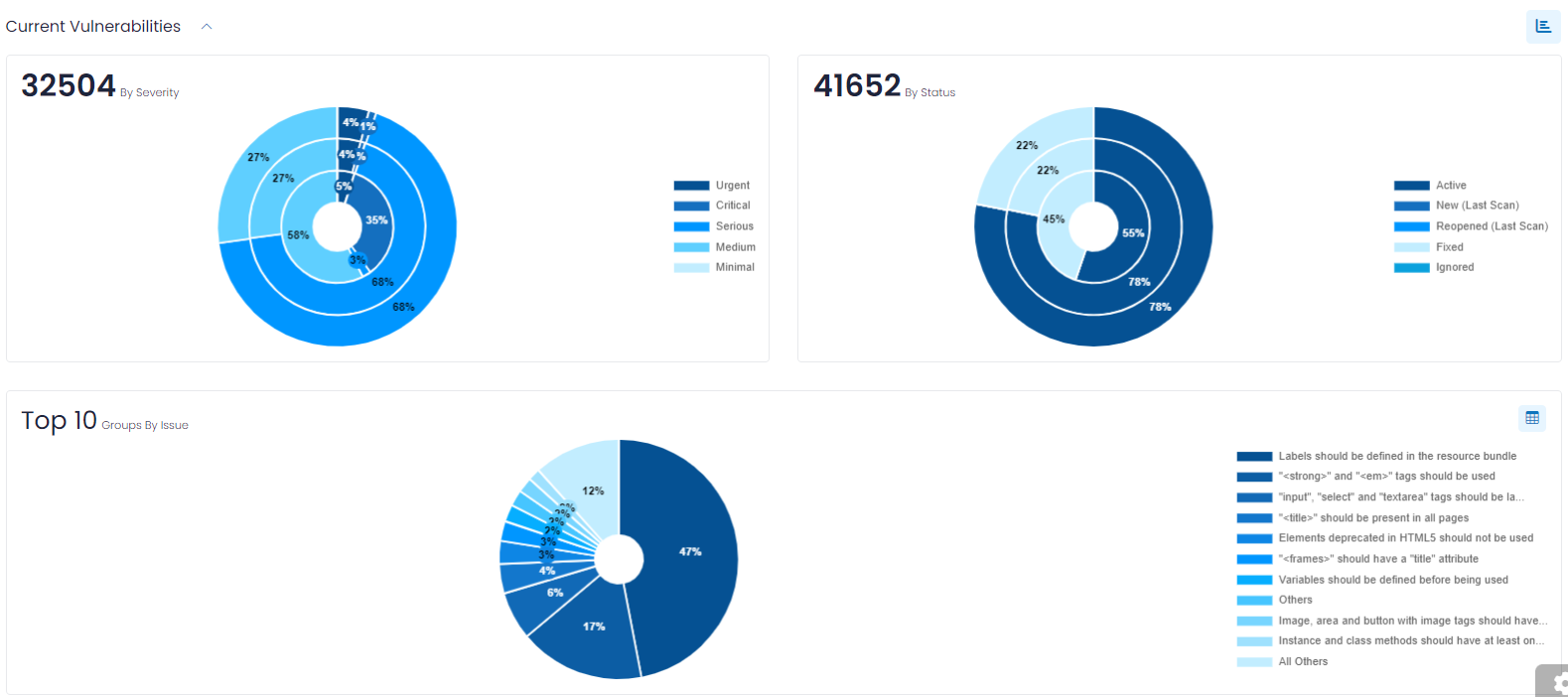
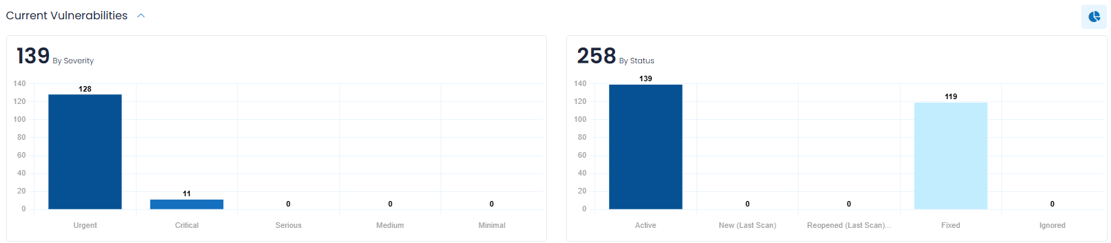
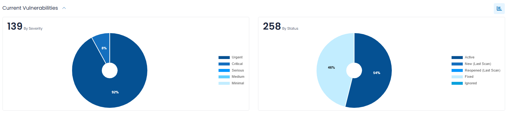
Current Vulnerabilities
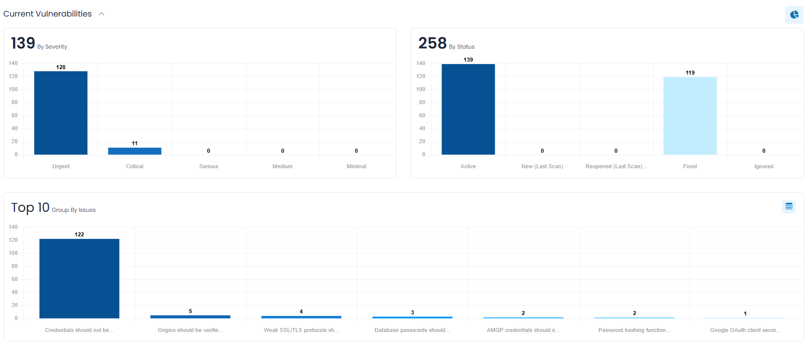
Current Vulnerabilities (which is a collapsible section) provides you with charts that show the current Vulnerability (and Bug) counts in the following categories:
- By Severity – which allows you to quickly focus on the most severe Vulnerabilities (and Bugs).
- By Status – to easily discern the current Vulnerabilities (and Bugs) by their status.
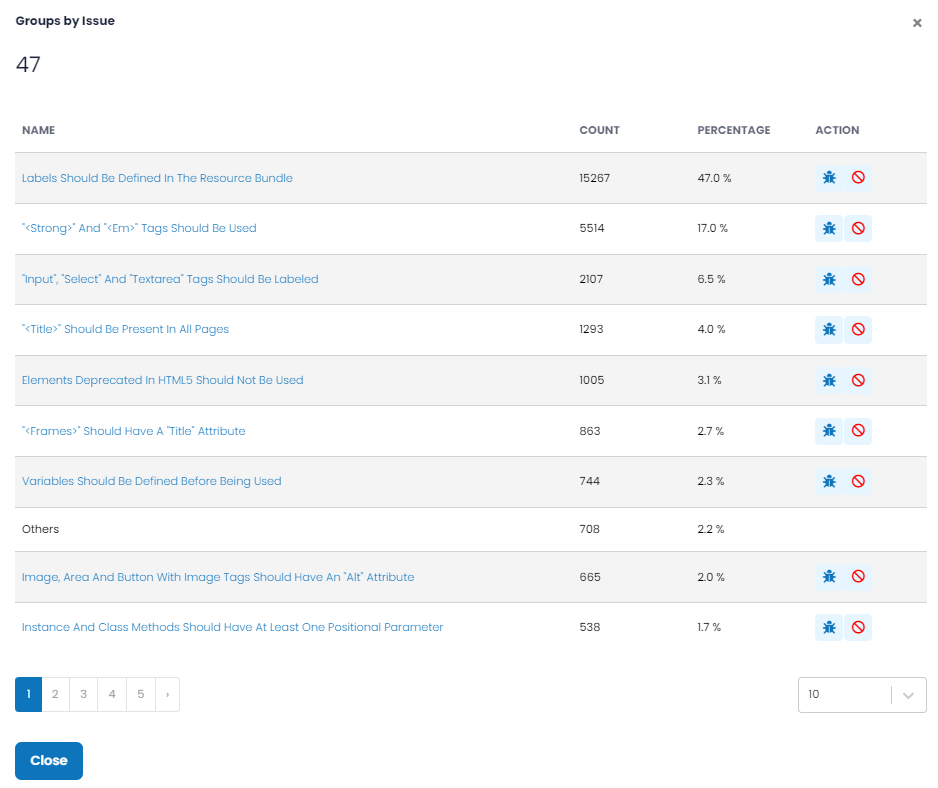
- Group by Issue – a grouping chart that shows your Vulnerabilities (and Bugs) in groups, to easily understand the types of each that are most common and that by addressing their underlying root cause can, enable you to address multiple vulnerabilities at a time.
For the By Severity and By Status bar charts, the counts are presented by three bars: in total, and then broken out by Vulnerabilities (and Bugs). If you opt for just one of Vulnerabilities (or Bugs), the chart is reduced to a single bar for each category.
By default, these counts are represented as bar charts. If you prefer to see the counts expressed as percentages and in a pie chart format, click the ![]() action icon to the right of the Current Vulnerabilities heading, as shown below.
action icon to the right of the Current Vulnerabilities heading, as shown below.
By clicking the ![]() action icon in the upper-right corner of those charts, you can view a pop-up (shown below) that lists all groups (not just the Top 10) and provides additional information. The action icon
action icon in the upper-right corner of those charts, you can view a pop-up (shown below) that lists all groups (not just the Top 10) and provides additional information. The action icon ![]() allows you to see each Vulnerability (or Bug) for the group.
allows you to see each Vulnerability (or Bug) for the group.
Vulnerability Metrics
Vulnerability Metrics (which is a collapsible section and is collapsed by default) provides insights into how long your open Vulnerabilities (and Bugs) have been open, and how long it took to close them. Often organizations have Service Level Agreements (SLAs) that commit them to addressing issues within a given timeframe, and this information helps you understand how well you are adhering to your SLAs.
The Vulnerability (and Bug) Metrics are presented in one of two formats that can be toggled by clicking the ![]() action icon on the upper-right hand portion of this section. By default, the Severity-based format is shown, which contains the following two bar charts.
action icon on the upper-right hand portion of this section. By default, the Severity-based format is shown, which contains the following two bar charts.
Days (Average Time Open)
This bar chart shows the total number of open Vulnerabilities (and Bugs) (upper right notation) and the average number of days (upper left notation) that each severity of Vulnerabilities (and Bugs) have been open. Hovering over the chart will also show how many Vulnerabilities (and Bugs) were considered for the metric calculations.
Days (Average Time to Closure)
This bar chart shows the number of Vulnerabilities (and Bugs) closed in the specified time frame (upper right notation) and the average number of days (upper left notation) the Vulnerabilities (and Bugs) were open before being closed.
Clicking on the ![]() action icon to the far right of the Vulnerability Metrics header displays a “Timeband” label, and breaks down the number of Vulnerabilities (and Bugs) by ranges of days, for example, those open less than three days, or between three and seven days. This data is presented in pie chart format.
action icon to the far right of the Vulnerability Metrics header displays a “Timeband” label, and breaks down the number of Vulnerabilities (and Bugs) by ranges of days, for example, those open less than three days, or between three and seven days. This data is presented in pie chart format.
Notice that the action icon used to toggle between Severity-based and Timeband-based formats changes.
SAST (Asset) List
This section of the dashboard lists all the established Accounts, their associated source code repositories, and branches. To better understand the operational details, let's breakdown the key features this sub-section offers.
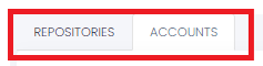
The upper left corner has the following two tabs: “Repositories” and “Accounts”, as shown and explained below.
SAST (Accounts)
The "Accounts" tab contains two sections:
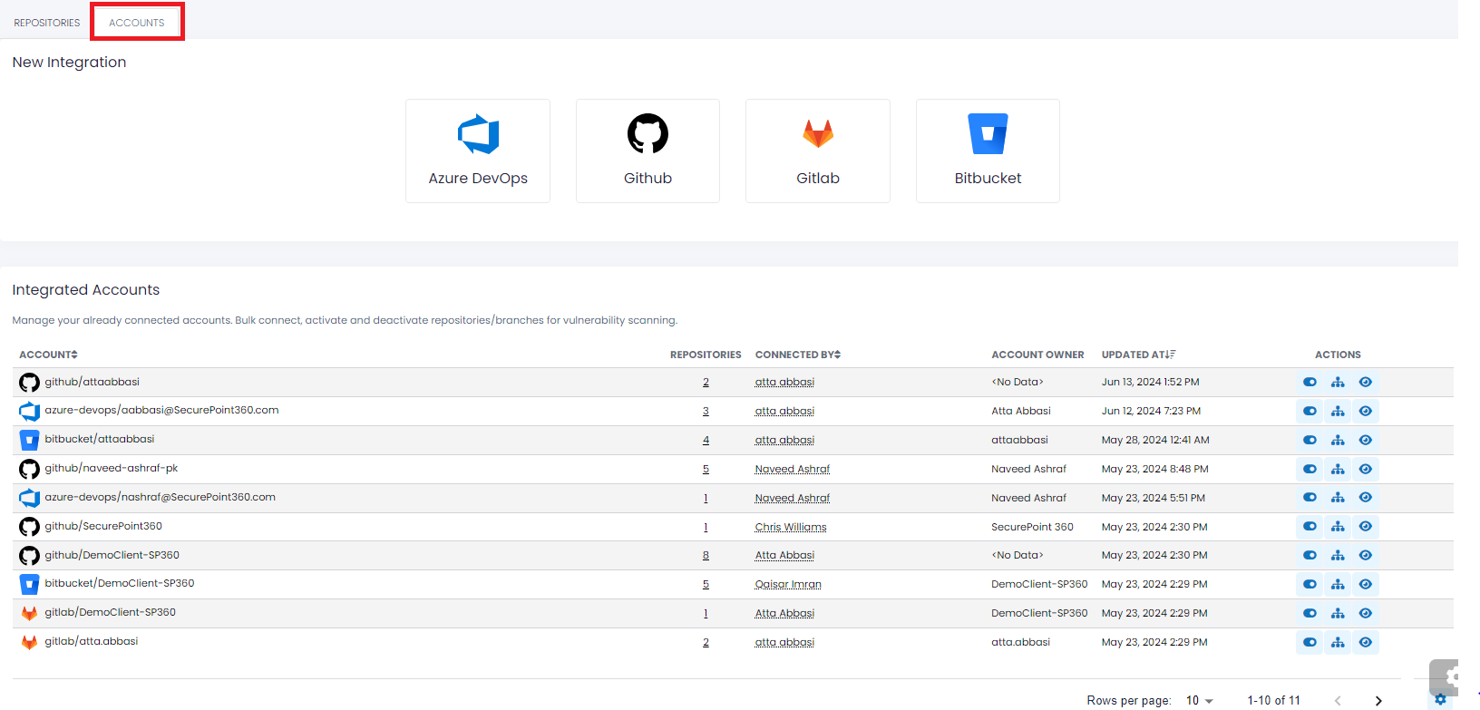
New Integration - This section allows users to connect/integrate new or existing accounts for the repository's platforms. SP360 currently supports the four most commonly used cloud-based repositories i.e., Azure DevOps, GitHub, GitLab, and Bitbucket.
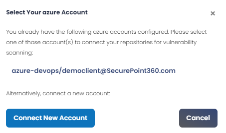
Clicking on any of the buttons associated with each of these cloud-based repositories will result in a pop-up window that allows users to either connect to additional repositories associated with an already integrated account, or connect/integrate to a new account (and then presumably connect repositories associated with that account for vulnerability scanning), as shown below.
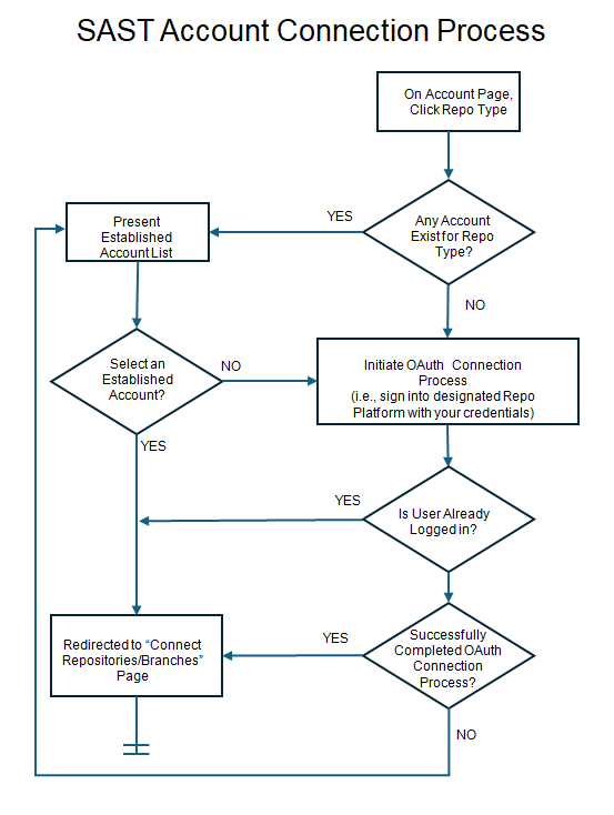
Note: While the user interface within SP360 is identical for all supported cloud-based repositories, the pre-requisite authorizations that need to be established vary from repository to repository. Once the required pre-requisites are established, the steps required to connect to and scan any cloud-based repository are the same. It is outside the scope of this help facility to describe how to establish these pre-requisite authorizations within each repository, however, the table below describes the requirements.
Azure DevOps BitBucket GitHub GitLab Required Permissions Any ONE of these permissions will suffice:
- Project Collection Administrator
- Project Collection Build Administrator OR
- Project Administrator
All THREE permissions are required:
- Admin
- Write AND
- Read
Admin Any ONE of these permissions will suffice:
- Owner
- Reporter
- Developer OR
- Maintainer
Best Practice It is preferred, though not required that the Repository Account Owner connect to the repository. The process flow diagram below explains the required pre-requisites that the user needs to establish to connect/scan any cloud-based repositories.
Integrated Accounts - Provides users a snapshot summary of the already connected/integrated accounts.
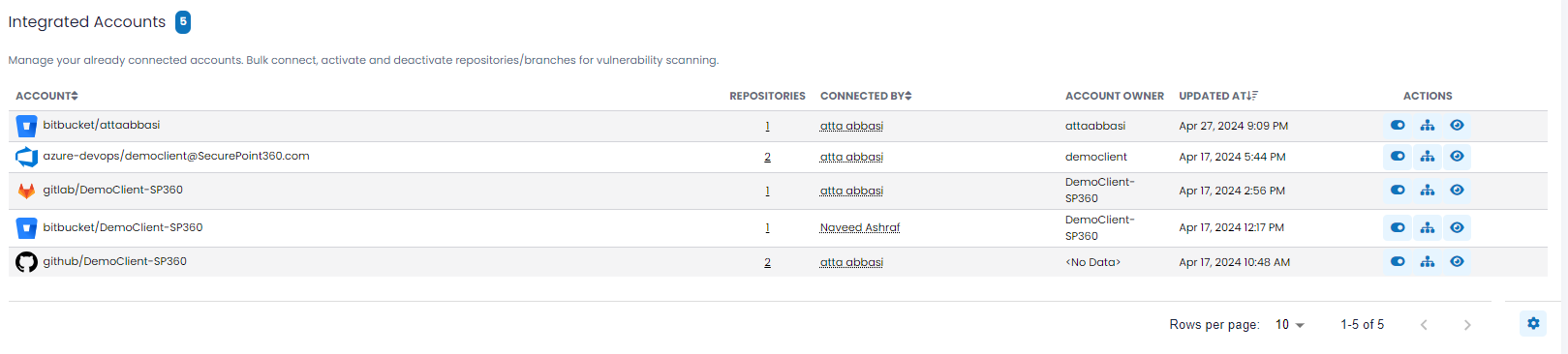
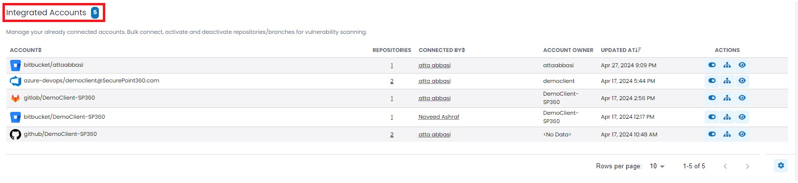
The upper left-hand corner in the “Integrated Accounts” section contains a blue box that reflects the number of accounts currently integrated.
The SAST (Accounts) grid includes the following fields by default, however, users can customize the grid to add, remove, or re-arrange fields to meet their needs by clicking the
 action icon, explained here.
Column Headers Definition ACCOUNT “Full” name of connected Account. Includes Repo Icon, Type, and Name. REPOSITORIES Number of Repositories connected using this Account. This is a drillable field. CONNECTED BY SP360 user that established connection to Repo Account. ACCOUNT OWNER Person that owns Repo Account. Often the same as “Connected By”, but not necessarily. UPDATED AT Last time action was taken (e.g. connect, or deactivate) that affected the status of the Account. ACTIONS The available Action Icons for Accounts (explained in the table below). To learn more about the optional fields that users can add, remove, or re-arrange in the SAST (Accounts) grid, click here.
Action Icons
Action Icon Description 
By clicking this toggle button, users can activate/deactivate scanning of all repositories associated with that account. When this action is taken, the row with the impacted account will be highlighted in pale yellow, and on the repositories tab, all impacted repositories will also be highlighted in pale yellow.

Clicking on this action icon for an already integrated account results in a pop-up window for users to add repositories for that account.
To explain the process of adding repositories/branches, let’s consider the example below.
Step 1: Clicking on the corresponding action icon for a GitHub-based DemoClient-SP360 account results in the following pop-up window which lists all available repositories.
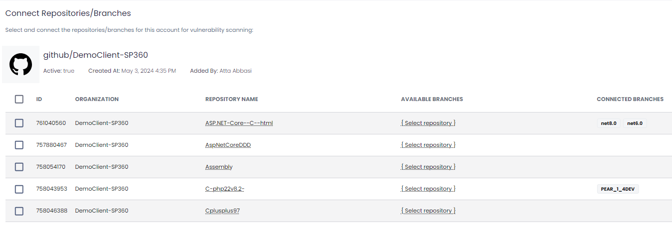
Step 2: Select the desired repositories by checking off the corresponding boxes in the first column. Users can choose multiple repositories, as needed.
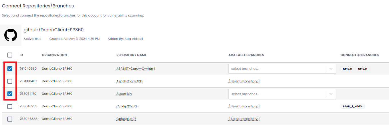
Step 3: For each selected repository, users are required to select the desired “Available Branches” from the drop-down, as shown below. This field also offers users a multi-select option.
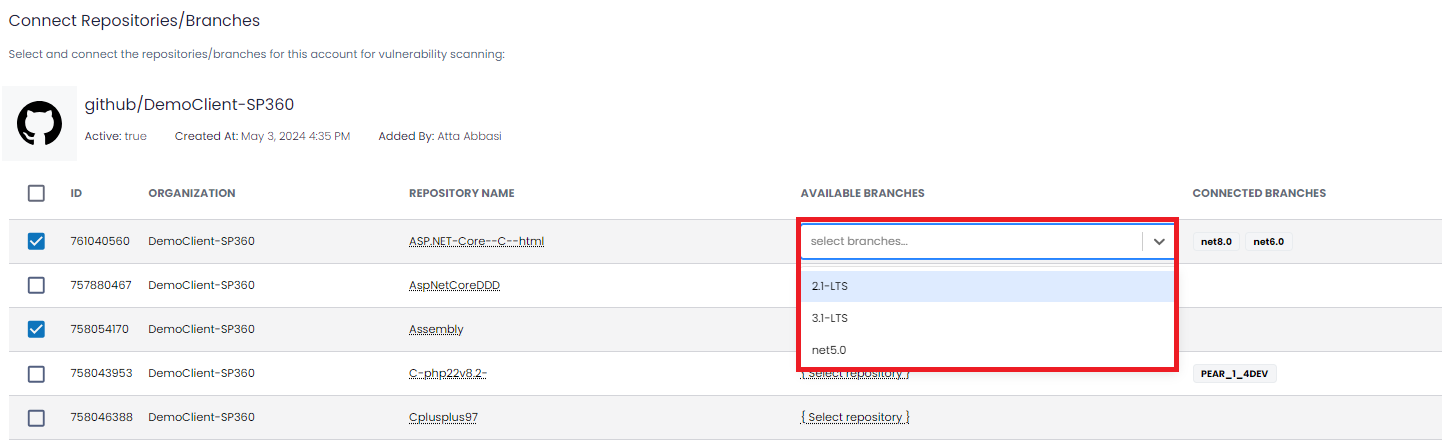
Step 4: Once the desired branches are selected, clicking on the
 will complete the process and add the selected repositories/branches to the SAST Account grid.
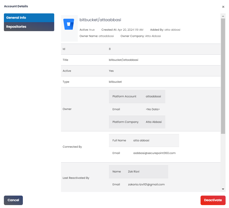
To view the account details for a specified account, users can click this button. The account details are displayed in a pop-up window, as shown below.
At the bottom right of the Details page is a button
 that provides you with an alternate way to deactivate the SAST. This will stop the scanning of the repository, until it is re-activated.
SAST (Repositories)
The “Repositories” tab lists all repositories and/or branches currently connected. SP360 will scan these repositories and/or branches looking for Vulnerabilities (and Bugs), as shown below.
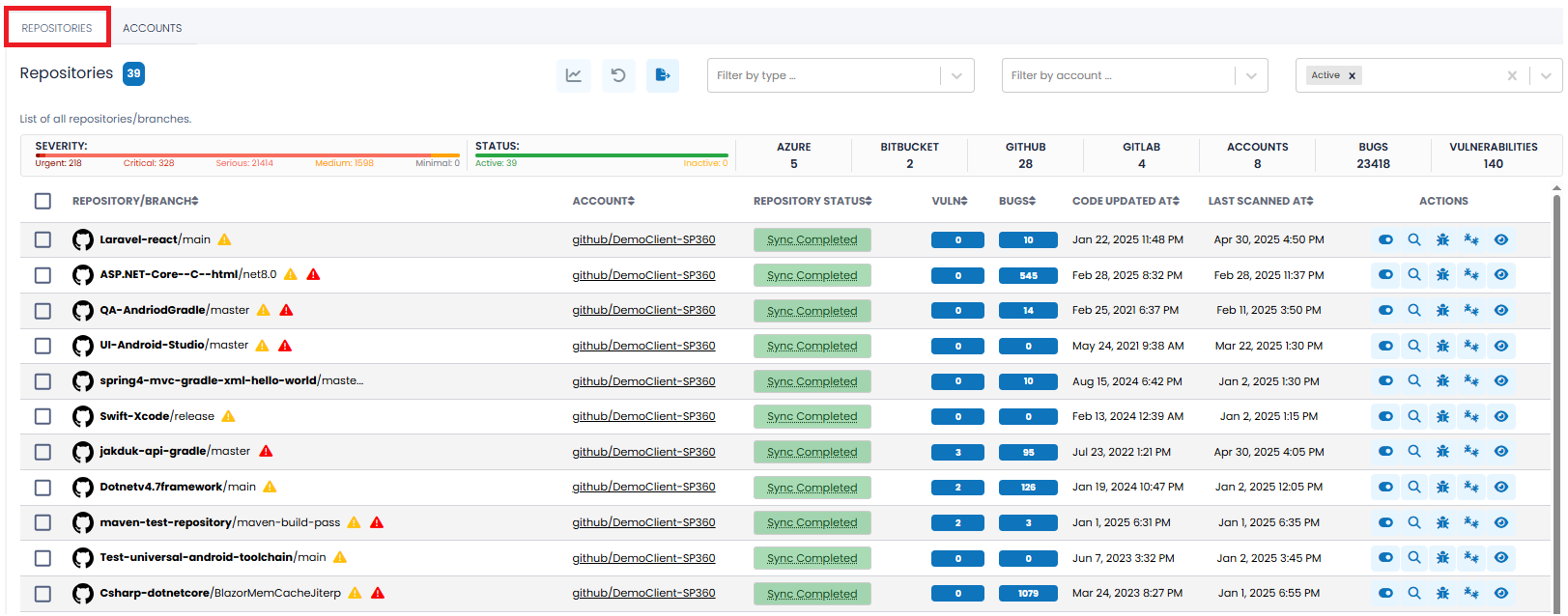
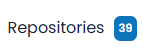
The upper left-hand corner on the “Repositories” tab contains a blue box that reflects the number of repositories/branches currently connected.
Filtering Options, Action Icons, and Summary Bar
To the right of the asset count, the SAST (Repositories) List offers a dropdown filter and three action icons.

Filtering Options
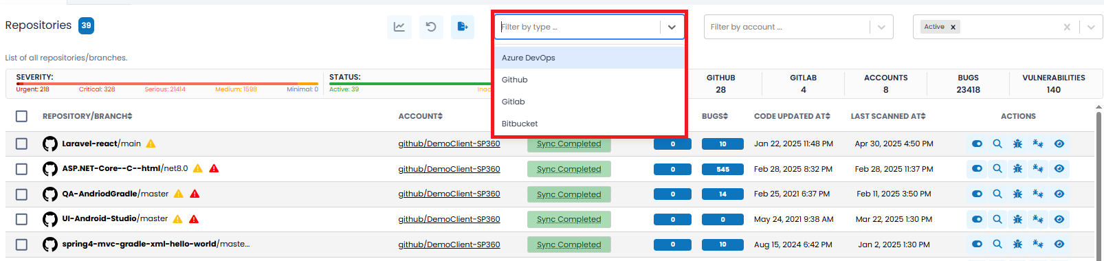
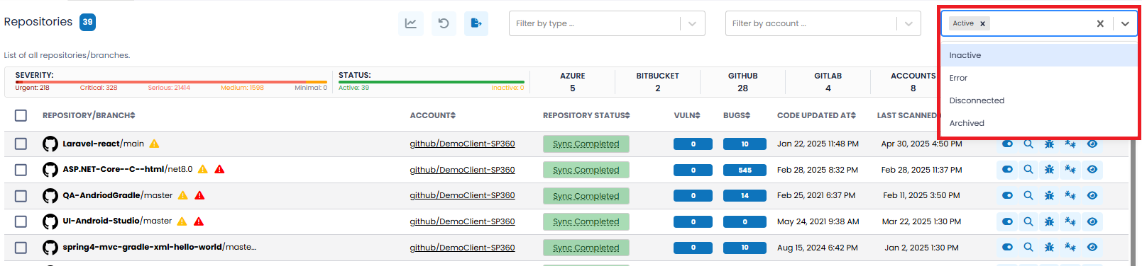
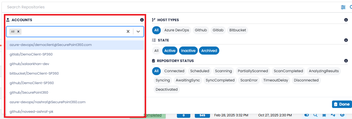
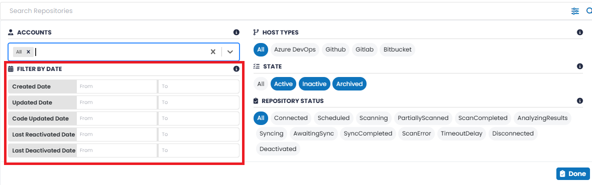
Clicking on the dropdown search filter allows you to select which repositories/branches to display based on the following attributes.
| Filter Type | Definition |
|---|---|
| HOST TYPES |
This filter allows you to select repositories/branches based on the cloud-based repository type. This filter has multi-select capabilities, allowing you to view results across one or more platforms simultaneously. Available options are:
|
| STATE |
This filter allows you to select repositories/branches based on their current state. It supports multi-select, enabling you to view repositories/branches across multiple states simultaneously. Available options are:
|
| REPOSITORY STATUS |
This filter allows you to select repositories/branches based on their current operational status. It supports multi-select, enabling users to view repositories/branches across various sync, scan, or connectivity states simultaneously. Available options include:
|
| ACCOUNTS |
Clicking on this filter displays a drop-down that allows you to select repositories/branches based on the specific account(s) they are associated with. The list includes all currently connected or integrated accounts (e.g., GitHub, GitLab, Azure DevOps, Bitbucket). This filter supports multi-select, enabling you to view repositories/branches linked to one or more accounts simultaneously.
|
| FILTER BY DATE |
Repositories/branches can be filtered based on key lifecycle events and timestamps. Available options include:
|
Action Icons
| Action Icons | Function |
|---|---|
|
|
Clicking this icon restricts the dashboard to display only the selected repositories/branches. This is helpful when you want to focus on a specific subset of repositories/branches – for example, those currently under review, being remediated, or scheduled for decommissioning – so the dashboard is not cluttered with findings from unrelated repositories/branches. |
|
|
Clicking on this icon results in resetting the dashboard to its default state.
The reset icon includes an annotation
( |
|
|
Clicking on this icon downloads (in CSV format) all details for all/selected list of repositories/branches. |
Note:
- You can select the checkboxes on the far left to filter the data to display only assets you are interested in. As the boxes are checked, a “Selected” counter appears and is updated, and the graph icon
 becomes active. The dashboard will not reflect the changes until the graph icon is clicked.
- Selections are retained across page scrolls, ensuring that any assets you select remain checked as you navigate through the list. To return to the default state, click the
 icon.
icon.
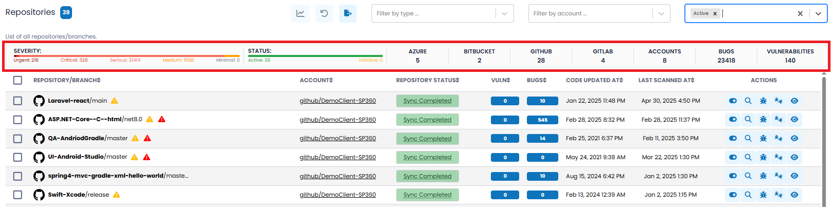
SAST Insights Bar
The SAST Insights Bar provides a consolidated view of code-level security and quality metrics across your connected repositories/branches. It summarizes the severity of identified issues, repository/branch status, source control platform distribution, and total vulnerability/bug counts.
This view includes two visual indicators (Severity and Status Bars) followed by several numerical summary tiles, all explained below.
-
SEVERITY Bar: This segmented bar shows the distribution of vulnerabilities by risk level:
- Urgent – Highest-risk code issues requiring immediate remediation.
- Critical – Severe weaknesses posing major security or stability risks.
- Serious – Significant issues needing scheduled resolution.
- Medium – Moderate issues that may affect quality or maintainability.
- Minimal – Informational issues with negligible impact.
Each segment is color-coded and labelled with the corresponding count of vulnerabilities, enabling users to quickly triage and prioritize based on risk level.
-
Summary Tiles: To the right of the Severity Bar are key numeric indicators that provide contextual scope:
- STATUS – Shows the number of Active and Inactive repositories/branches.
- AZURE – Number of Azure DevOps repositories/branches.
- BITBUCKET – Number of Bitbucket repositories/branches.
- GITHUB – Number of GitHub repositories/branches.
- GITLAB – Number of GitLab repositories/branches.
- ACCOUNTS – Total number of connected accounts.
- BUGS – Total number of code-level bugs detected across all repositories/branches.
- VULNERABILITIES – Total number of identified security vulnerabilities across all repositories/branches.
These summary counts update dynamically as filters are applied, providing a real-time overview of the vulnerability landscape tailored to the user’s focus area.
The SAST (Repositories) grid includes the following fields by default, however, users can customize the grid to add, remove, or re-arrange fields to meet their needs by clicking the action icon, explained here.
| Column Headers | Definition |
|---|---|
| REPOSITORY/BRANCH |
“Full” name of the Repository/Branch. Includes the Repository icon, Repository Name, Repository Branch, and a tool tip indicator, if applicable. Tool Tip Scenarios
|
| ACCOUNT | Account used to connect the Repository?Branch. |
| REPOSITORY STATUS | Current status of the Repository/Branch. Includes the following states: Connected, Sync Completed, and Deactivated. |
| VULN | The number of currently existing Vulnerabilities for the selected Branch. This is a drillable field. |
| BUGS | The number of currently existing Bugs for the selected Branch. This is a drillable field. |
| CODE UPDATED AT | Last time code changes were submitted to Repository/Branch. |
| LAST SCANNED AT | Last time the Repository/Branch was scanned by SonarQube. |
| ACTIONS | Row-level action icons, explained in the table below. |
Action Icons
| Action Icons | Description |
|---|---|
| By clicking this toggle button, users can activate/deactivate scanning of all repositories. |
 | Users can initiate a manual scan for the selected repository/branch by clicking this action icon. Typically, SP360 will scan a repository whenever changes are submitted (on a two-hour cycle), so manual scans should not be required often. The typical scenario is that a problem fix was attempted and the user wants immediate feedback on whether the fix worked. |
 | By clicking this action icon, users can view vulnerabilities associated with the selected Repository/Branch. This functionality is also available by clicking the linked value in the Vulnerabilities column. |
 | This action icon displays bugs associated with the selected repository/branch. This functionality is also available by clicking the linked value in the Bugs column. |
| To view the account details for a specified account, users can click this button. The account details are displayed in a pop-up window, as shown below.
At the bottom right of the Details page is a button |